From the perfectly honed decrescendo of a symphony’s string section to the down-home chord progressions at a late-night kitchen party, Headrick’s stories question the subtle differences between hearing and listening, communicating and understanding.
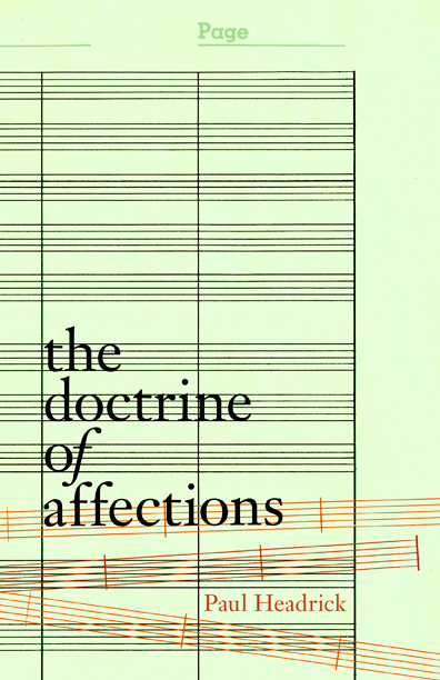
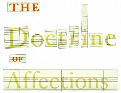
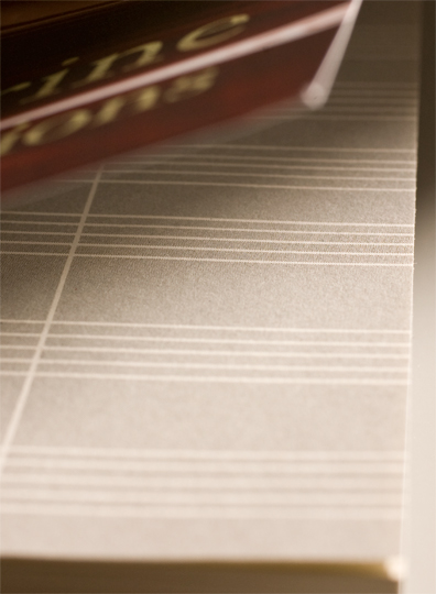
The phrase Doctrine of Affections refers to the baroque ideal that music embodies the most profound emotions and that a single musical movement should arouse a single emotion in the sensitive listener. Staff lines on the flyleaf. The serif face is Linotype Janson Text, released in 1985 and based on the baroque typeface design by Miklós Kis originally completed in the late 17th century. Bits and pieces from the start of the title block that were cut out of some light green, 70’s-era composition paper.
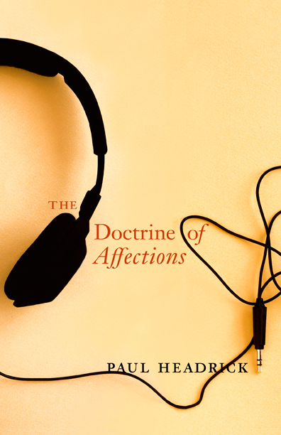
I initially presented three cover concepts: (1) An old photo of some distressed sheet music that I took with my first SLR (a little Pentax MZ6). Scanning the dusty black+white negative brought out a lovely red/orange tinge that I accentuated afterwards. (2) A mandatory accessory on any long walk, complete with the tangled cord. I like the interaction and awkwardness of the type in this one. (3) A simple, graphic approach influenced by some retro composition paper I found.

