
I am running out of interesting ways to put paintings on book covers.
I usually try to talk the publisher out of it. The original artwork is produced at a specific scale and isn’t meant to be experienced as a thumbnail. There are usually strict rules set in place by the museum or artist that prohibit cropping, bleeding, or adding type, which severely dampens creative freedom. The proportions rarely fill a 6 x 9 cover, so the designer is forced to set it against a bland flood of colour. The texture of the paint, brushstrokes, and canvas is lost. Modern digital printing technology can’t replicate the colour properly. (Just to name a few reasons…)
My first time tackling an art cover demanded several mock-ups until I found a way to use the prominent art piece in a dynamic but still respectful way.
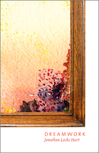
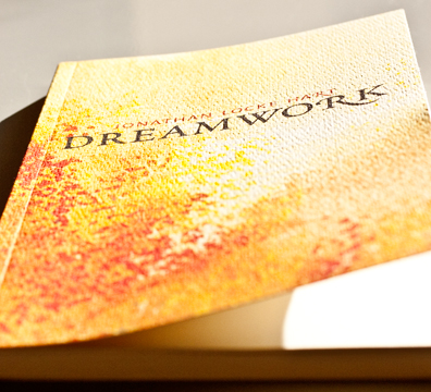
My next attempt was for Dreamwork, Jonathan Locke Hart’s latest book of poetry. To make things even more challenging, the watercolour on the table was painted by the author’s mother. (No talking anybody out of that one.) Fortunately Hart values graphic design and art equally, so I proposed some alternative ways to display the piece.
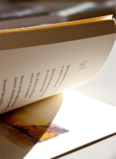
But how many times have you seen a picture frame or a page turn on a book cover?
So I took an abstract approach instead by magnifying an area of the landscape with great light, and printed the jacket on a textured paper that mimicks the surface of canvas and augments the stippled brush work. The full painting was revealed following the last poem in the book.
(American artist Titus Kaphar might be heading in the right direction by obscuring and shredding the paintings…)

