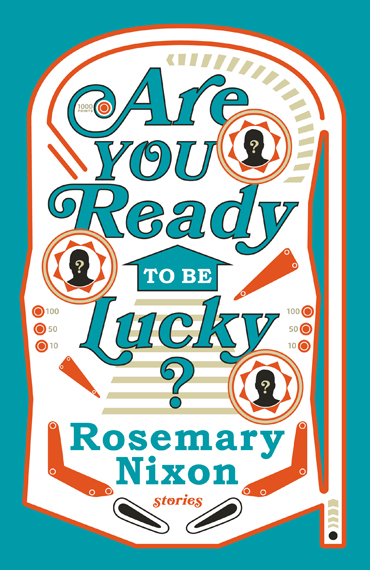
This book falls somewhere between a novel-in-stories and an interconnected short story collection. At the outset, the editor described the structure as something like a pinball machine. You never know exactly which character you’re going to get, as they pop up and then disappear, in a relentless pursuit of happiness, trying again and again to get it right. The three male silhouettes on the circular bumpers represent the men Roslyn ricochets between: Harold, Duncan, and Floyd.
One of the stories (called “In Which Floyd’s Speedometer Surpasses the Million Kilometer Mark and Friends and Acquaintances Reduce Their Clutter”) even shares pinball game terms in the footnotes. For your delight and education:
Thwacker: A funnel-shaped device where the ball enters at the wide top and spins to the narrow bottom.
The backbox: The backbox portion of the table serves two purposes: to hold the main electronics of the game. And to attract players.
Nudge: A method of trying to control the ball by moving the machine.
After many hours and coins spent on “research,” my arcade illustration was declared unduly frivolous — a far too literal depiction of “luck.” So it was GAME OVER for me. (Couldn’t resist.)
See more
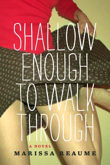
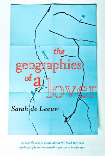
The narrative of Marissa Reaume’s forthcoming novel incorporates some typographic styling: the main character, an aspiring writer, uses strikethroughs to eliminate events and parts of her life that she doesn’t like. I wanted to work with this same idea on a type-dominant cover.
During my read-through, I found the perpetual grey skies and struggling characters to be pretty bleak, and was having trouble reconciling my interpretation with the colourful chick-lit presentation the publisher requested. So, stubbornly, I failed with my first three attempts, which were deemed too drab and muted. I was asked to try again, to incorporate a photographic image of a woman somehow, and to shoot for something more arresting, urban, and whimsical. So I re-read the MS and focused less on the puddles and more on the lively, energetic scenes: dancing and hot pink toe nails are featured prominently in the plot.
A fun fact: when you paint letters on paper with nail polish, it basically never dries. Seriously, 5 days and counting, and it’s still tacky.
See more
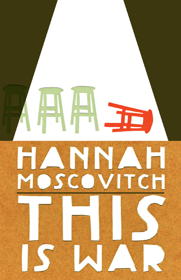
Playwrights Canada Press is working closely together with the Banff Centre Press to co-publish three plays by three different authors. They were seeking unique designs for each book that relate visually as a matching set. I started with the first two, by Daniel MacIvor and Hannah Moscovitch, which will be released in the fall. The third, by Colleen Murphy, will follow in spring 2014.
The first direction relied on construction paper cutouts, simple objects, and a limited colour palette of red, green, and brown, to tie the books together. For MacIvor’s cover, I was determined to render a scene from the last act, in Carl’s declaration to Yori, when he describes a marble-sized world that exists only in his head and his struggle to not fall off. For Moscovitch, I chose stools to represent the four Canadian soldiers being questioned by an unseen, unheard interviewer about an traumatizing occurrence in the Panjwaii desert.
The selected direction proposed plain black silhouettes adorned with emblems from each play. It’s a flexible system that should lend itself well if PCP & BCP decide to expand the series in the future.
See more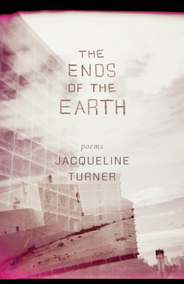
A poetic guide for the apocalypse. Jacqueline Turner’s work touches on technological disasters, environmental nightmares, and broken relationships.
She sent along some photos, taken with her phone, of an earth as seen through an urban grid. (This particular globe is in the lobby of the Fairmont hotel in Vancouver.) I tried to conceptualize this using a fish eye lens, a topographical map, and some grid paper, but wasn’t happy with the result which felt really flat despite the curvature.
My next turn played up the technology theme with unravelling loops of wire. Still wasn’t thrilled at this point.
Because the collection juxtaposes urban settings with deserted islands, I set out looking for a windswept, double exposed photo for use on the cover. Here is one of the passages from the “Castaway Series” in the collection that influenced the look and feel of the cover:
“dear sailor every night the stars speak of you. the north star seems particularly infatuated with your image and whispers adagio as salty spray hits your worn back. a moment here is eternity light folds into waves and this world is rebuilt second by second, an ephemeral mirage. the tissue of our connection floats on the wind, a lost kite that may some day be returned to its flyer. i have cast out many strands, dear sailor, i have told the stars this story.”
See more
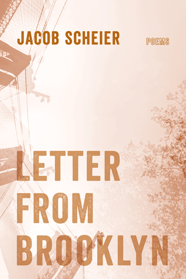
The cover of Jacob Scheier’s last collection, More to Keep Us Warm, featured an illustration by Jason Kieffer. He generously provided some great sketches for consideration and I jumped in with some concepts of my own as well.
Instead of a Brooklyn street scene, I thought a view from the street, looking up, might be less conventional and better matched to the author’s voice. I was inspired by the line “how Brooklyn makes me nostalgic for the moment I am walking inside of” and the way Scheier contrasts the bridge on the skyline and tree branches bent over the streets. A busy scene with lots of traffic wouldn’t achieve the same sense of loneliness.
I was trying to veer away from imagery of the Brooklyn bridge, but I think it becomes quite interesting when abstracted as a pattern. When turned on its side, the bridge cables look like telephone wires, connecting people on the left and right.
Then there’s my “letterhead” idea, which I don’t believe anyone liked.
See more
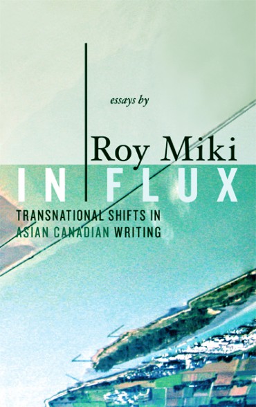
Another book in NeWest’s Writer as Critic Series. In this collection of essays edited by the University of Guelph’s Smaro Kambourelli, Roy Miki investigates the shifting currents of citizenship, globalization, and cultural practices facing Asian Canadians today through the connections of place and identity that have been forged through our developing national literature.
At first, I wasn’t thrilled with the imagery provided by the author: an aerial view of the coastline with the Fraser River taken from a seaplane. But it’s the landscape that would form the conditions of early settlement for Asian Canadians, so, conceptually, it’s a strong match for Miki’s work.
I then turned to idea #3 on my “I’m totally stumped and can’t deal with this dull photo you gave me” list: turn it upside down and crop it so it’s barely recognizable.
See more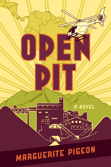
Open Pit is a political thriller dealing with two clashing cultures and the costs of doing business in the era of globalization. A group of Canadian human-rights activists visiting Central America are taken hostage by a former revolutionary fighter demanding the closure of a newly-minted open-pit gold mine.
The client asked for a cover that hints at international intrigue and adventure without looking too much like a Tom Clancy novel. Matt Taylor’s intimidatingly good illustrations for the latest John Le Carré novels were cited. Ideas tossed around included Salvadorian soldier portraits, Castro-esque figures attired in fatigues, AK-47 memorabilia, and a mock twentieth-century advertisement for South American tourism. The retro poster seemed like a good way to portray the action-packed foreign setting without showing scenes of violence or environmental devastation caused by mining. Because the publisher is located in Alberta, an ecological approach could cause the book to be incorrectly lumped in with diatribes against the oilsands.
I mocked-up a sunny Cuban travel brochure trying to attract visitors (or, in this case, readers) oblivious to the unrest of the region. The image started out at Post-it sketch. Most covers are inaugurated on 3 x 5″ sticky notes, which then end up attached to various pieces of office furniture and sometimes socks. (The plane morphed into a more plot-relevant helicopter and the dynamite just didn’t make the cut.)
See more
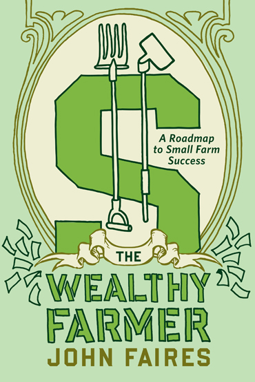
“How to Manage Your Land and Run a Profitable Farm” . . . as told by a man who studied business management and originally scoffed at the idea of farming as a legitimate way to earn an income. (Also note that he was not an outdoorsy guy and was addicted to fast food, which make for intriguing prerequisites.) After a really successful transition to food-grower/hoe-holder, he shares his business model.
The author envisioned the cover as a photo of himself standing in front of his farm with a pitchfork and a handful of money. But unfortunately/fortunately this photo shoot did not happen, so it was my turn to come up with an idea. Since the emphasis of the book is on profitability rather than raising chickens and feeding your family, I upheld the dolla billz, combining them with garden tools to make a creative ‘$’ in an illustrative style.
(You’ll notice this post is categorized under both “Published” and “Rejected” since the manuscript has been delayed and I’ll be waiting on approval for a while.)
See more
The author introduced this collection with the following words:
Marie’s subjects are the charms and difficulties of love of various kinds and the way goodness and wickedness are rewarded and punished in a complicated world. But it would be a disservice to her and to the poems to try to extract a philosophical or political “position” from pieces that are, I think, written as entertainments and deliberately mixed in approach and attitude. One might think of these poems as toys for adults, for they are decorous variations on themes from fairy tales and Märchen.
And then he sent along a fantastical picture of a werewolf for use on the cover.
Using futuristic folklore imagery on the cover seemed incongruous with the lyrical translations of twelfth-century french lais inside. I wanted to describe a creature of fable in a style that doesn’t contradict the era quite so loudly. So I roughed out a tail with some ink, leaving the face of the beast to the imagination, and paired it with the most geriatric typeface I could find (though it’s still a few hundred years younger than the High Middle Ages) Bruce Rogers’s calligraphic Centaur.
See more
This is a spiritually complex novel about a man named Sam growing wings and a woman named Lilah finding meaning in violence and pain.
Sam periodically sheds feathers, which crumple and turn into black dust as they fall to the ground. I combined feather and dust imagery on the cover to show this disintegration, but also to imply creation (like a phoenix rising from the ashes) so that the cover references the transformation of both characters, not just Sam. (The ash in this case is graphite powder shaved onto my scanner bed.)
My other draft focuses on only one of the story lines. Sam is forced to rip holes in all his shirts to accommodate the wings, which is exactly what I’ve done in order to show, in a simplified way, how his metamorphosis has produced “a great gaping hole where his life used to be.”
See more

Originally we thought the best solution for the cover of this handbook might be to avoid grow-op, basement, and marijuana plant imagery entirely. However, the sales folks laid down the verdict: my designs look like they belong with fiction rather than a non-fiction gardening book. Plus, it’s not at all evident that we’re splurging on a 4-colour interior. I was hoping the market differentiation would be viewed as a positive thing, but not so. Comparable titles have photo-based covers, so that’s the direction we went in, using a foliage snapshot the author supplied.
I just don’t think anyone appreciated my artificial grow-light mise en scène.
See more
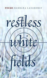
Barbara Langhorst’s unsentimental collection of poetry revisits a violent personal tragedy. Over the course of the book, we learn that the author’s father shot and killed her mother, then committed suicide.
Treading lightly around such difficult emotional territory, it was a challenge to determine the right marketing approach for the book and how much information to reveal about the traumatic subject matter.
My initial idea, a few wispy pieces of Kleenex, was fuelled by a line from the collection: “your steps corner the bed your living death fades forgotten in tissue paper slips.” It was considered too amorphous, not drawing a strong enough connection to grasses in a pasture like I intended.
The gunsight concept went too far the other direction: overly aggressive and emphatic. The author wanted to focus on the themes of healing and rebuilding, rather than the brutal event itself. The final cover removed the weapon reference, leaving just the cold, blanched field and some translucent type.
The typeface is Goudy’s lyrical Deepdene, with some very sexy ligatures.
See more
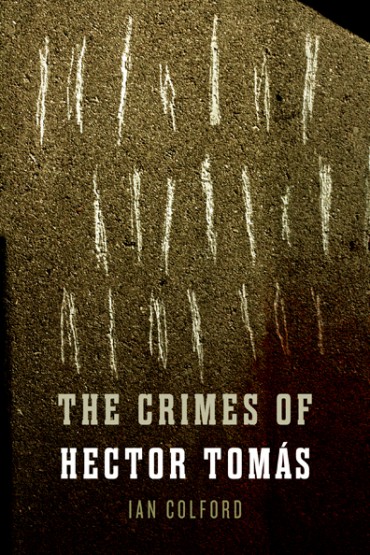
This is an epic novel — both the physical size of it, and its ability to induce traumatic nightmares — about disappearance and deception, family and nation. Exiled by his parents to the isolated countryside, Hector is accused of terrorism — a crime of which he is innocent, yet ruthlessly punished. As he tries desperately to extricate himself from the violence perpetrated by a brutal political regime, he realizes that freedom can only come at a terrible price. It’s one of those books you have to take breaks from in order to regain some sense of calm and morality.
My first comp anchors the title on two levels potentially: as a tally of crimes committed by Hector Tomás, or as scratches in a cell wall where someone is being held and tortured.
The second, which you will see on shelves this September, hides eerie scenes behind letters, obscuring a medley of images relating to violence, male and female figures, and trains.
See more
Finally, an occasion to work with erotic prose poetry.
This cover was taken out of my hands somewhat when I was supplied with a photo commissioned by the author. The client felt that the skin textures in Briar Craig’s photography evoked landscape. While in fact this is the cover we went with, I still think it communicates a different message. There is the visceral that conveys sensuality, deep emotion, and animal instincts (i.e., sex) and then there is visceral in terms of things looking like internal body organs. The image speaks to the latter for me.
I wanted to find a means to link wayfinding and sexuality without showing skin. I fought for this concept (below), pinpointing erogenous areas on a hand-drawn body, sketched like a map. But ultimately it was deemed too cold and flat.
The text-dominant back cover combines promotional blurbs with poetry from the interior and the contents page upholds the navigational theme with latitude and longitude references.
See more
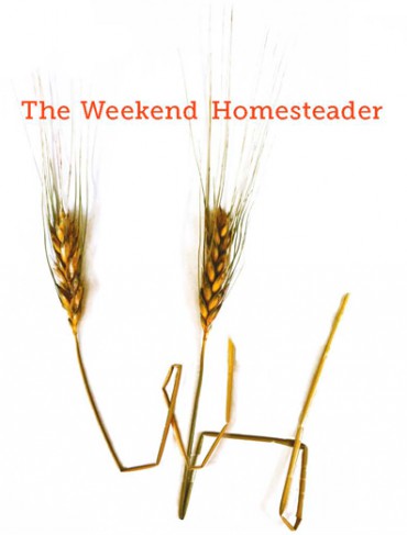
I formed some letters using wheat for a 12 month homesteading guide forthcoming from Skyhorse Publishing in New York. (A tip: wheat isn’t as mouldable as you might think — I had to soak it for a while before I could manipulate it.) The projects are organized by month and suitable for all kinds of self-sufficient folks, whether you live on a forty-acre farm, a postage-stamp lawn in suburbia, or in a high rise.
See more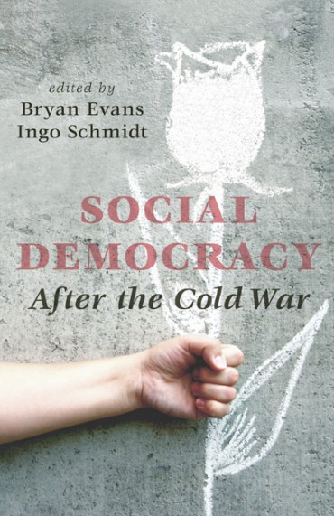
Offering a comparative look at social democratic experience since the Cold War, this volume examines countries where social democracy has long been an influential political force — Sweden, Germany, Britain, and Australia — while also considering the history of Canada’s NDP.
The editors wanted to use the Socialist International rose-in-fist image on the cover. My proposal for a more informal and inventive interpretation of the organizations’s poetic logo was approved.
See more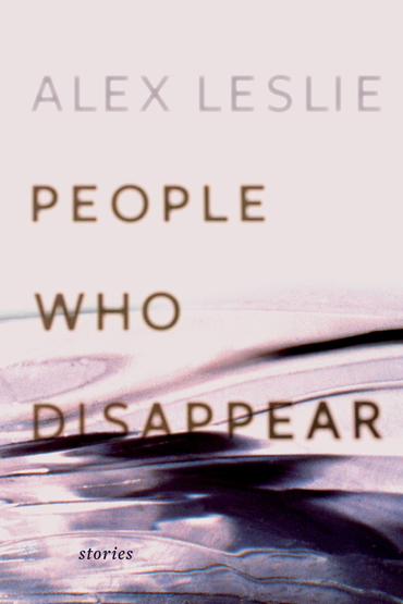
You already indulged my artistic ego by reading my cover design eulogy for Alex Leslie‘s poetic short fiction debut. After seeing the finished book in tangible form, I am done complaining. The approved design exhibits subtle colour shifts and whispery, barely-there type that really fits with the words, which have been described by reviewers as smoky, ominous, and surreal.
I created the ghostly display type by printing the title page (set in Freight Sans by Joshua Darden of GarageFonts) and photographing it out of focus.
The page numbers slowly migrate down the bottom margin, like a flip book, so that the final few folios disappear off the page. The printer thought it was a mistake and paused the job, of course.
See more
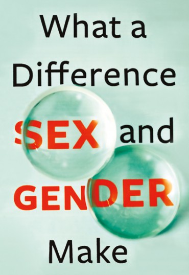
The Gender and Health branch of the Canadian Institutes of Health Research brought together some new research and approached me for the packaging of 12 cases. One of the cases discusses the idea of a “gender lens” that prevents industry professionals from seeing issues clearly as they pertain to males and females … which turned into the most challenging photo shoot I have ever attempted. I purchased several convex and concave lenses from a high school science supply store and experimented with placing the lenses over the title in different ways.
And, because it’s a government publication, I had to do it all over again in french, of course.
See more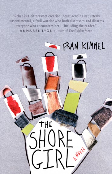
The Shore Girl follows Rebee from her toddler to her teen years as she grapples with her mother’s fears and addictions, and her own desire for a normal life. Through a series of narrators — family, friends, teachers, strangers, and Rebee herself — her family’s dark past, and the core of her mother’s despair, are slowly revealed.
Rebee and her mother usually escape their problems at night, ricocheting around rural Alberta in a busted white van.
Another concept I presented was derived from the preliminary title “The Shore Girl Clippings” which refers to the nail trimmings that Rebee saves in a jar and carries around from place to place. She also has a slightly mangled hand from when her mother refused treatment for a broken finger. These character traits were just begging for a collage of some sort.
See more
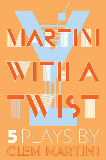
This project came with a title pun of sorts and a too-good-to-be-true brief: “just do some kind of bold, colourful, perhaps Art Deco-style all-text cover.” I went straight to the typeface Bifur, originally designed by Cassandre in 1929 and recreated by P22 in the 90s. The ‘Y’ letterform already looks a bit like a martini glass, it only needed minor adjustments.
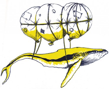
About the plays: Absurdity reigns in multiple award-winning author and playwright Clem Martini’s newest collection of work: five plays spanning two decades, from 1989 to 2009. A lonely elephant handler befriends the half-blind woman who drove through his yard, a severed head in a suitcase life support system is given a second chance at life, a quiet shut-in wrestles with the jealous ghost of his wife, a young woman with the ability to smell lies struggles to make new friends, and a mismatched pod of whales in the Pacific Ocean struggle with identity, love, and interspecies dating. With a sharp tongue and impeccable comedic timing, Martini’s characters resonate beyond their impossible situations, their fears and hesitations all too human.
The other concept I was asked to mock up is a whale swimming inside a martini glass. I gave it a go, I really did, but it somehow evolved into a martini-fuelled photo shoot using the glass I was drinking from to obscure the title.
See more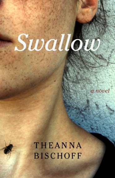
Theanna Bischoff‘s new novel pieces together the childhood memories of Darcy Nolan and the moments leading up to and following her nineteen-year-old sister’s suicide. Each section of the book begins with a verse of the rhyme, There was an old lady who swallowed a fly, which influenced the cover imagery.
See more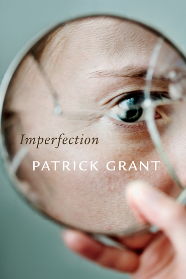
“. . . aspirations to perfection awaken us to our actual imperfection.”
– Patrick Grant
The client provided this loaded excerpt as a brief and it gave me lots to think about:
“As Bruce Bartlett (advisor to Ronald Reagan and the first President Bush) told New York Times reporter Ron Suskind: ‘This is why George W. Bush is so clear-eyed about al Qaeda and the Islamic fundamentalist enemy. He believes you have to kill them all. They can’t be persuaded, that they are extremists, driven by a dark vision. He understands them because he is just like them.’ One of the best books on the recent Northern Ireland conflict is Richard Davis’s Mirror Hate (Aldershot: Dartmouth, 1994), and, among other things, it can help to clarify some implications of Bartlett’s remark. In this elegant and telling analysis Davis shows that although Republican and Loyalist paramilitaries are enemies, they also mirror one another. The enmity in itself is not difficult to describe because it is plainly declared by the opposed factions and their propagandists. But a further process of ‘unconscious convergence,’ whereby the opposed factions come to resemble one another, is more difficult to discern. That is, if we hate with sufficient intensity, we unwittingly become like our enemy, mirroring our enemy’s strategies and our enemy’s thinking. And in this ‘symbiotic antagonism,’ says Davis, the simplifications of propaganda readily triumph over ‘humanity and common sense.’ “
Cover photo by Lauri Rotko.
See more
I was asked to do the impossible: create an image that blends the author’s Cree/Ojibwe/Scottish/English heritage. Naomi McIlwraith’s new collection of poetry is written in both English and Plains Cree, and focuses on the concern of language loss.
Below is my preliminary pencil crayon sketch for the title block. Root imagery not only pops up often in the text, but is a fitting way to represent McIlwraith’s intricate lineage. Her work talks about language being rooted in the land, the multiple definitions of Seneca root, and the structure/roots of words.
See more
I recently traveled to Toronto to network heckle Chip Kidd and frequent the Umbra store. Somewhere between this and this, I convinced ECW Press to give me a shot at a book cover.
Next thing I know, a brief arrives in my inbox and the author, Jamie Sharpe, is listing Julie Morstad as inspiration for imagery. Her aesthetic oozes the same anachronistic yet slightly sinister feel as the book. I quickly realize the bar is set high and start to panic.
The following Saturday night, after a few inadequate mockups involving aprons (“husbandry”) and antlers (“animal”) have materialized, I’m out socializing drinking scotch on a pal’s living room floor and I realize there’s a framed print hanging on her wall that seems to have been crafted specifically for one of the poems in the collection. So I deciphered a few initials in the illegible signature and set out to stalk the recent ACAD grad who made it.
Just short of Facebooking a total stranger and/or going to the mall to surprise him at his part-time retail job, I found Reagan Cole McLean.
Here is the aforementioned stanza, from the poem entitled The Dundreary-Arts:
“What is the parable of the whale? He floats wall-less,
Without history, secure in his girth like a slumbering god.
Awake: for we have a silver dollar with your name.”
The second runner-up uses artwork from the interior. I was drawn to the graphic nature of the piece and the obscure assortment of imagery: a dead bird, a hammer, a timepiece, a torso, and a screaming mouth. Good mix.
See more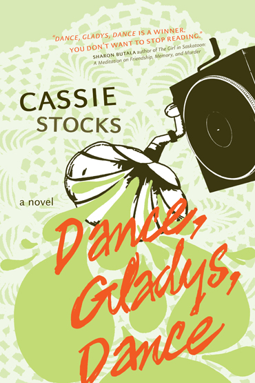
Five Steps to an Ordinary Life:
1. Get a real job.
2. Stop seeing the world as a series of potential paintings.
3. Learn how to talk about the weather.
4. Do the things that normal people do.
5. Figure out what normal people actually do.
The synopsis for the 2012 NeWest Press release: 27-year-old Frieda Zweig is at an impasse. Behind her is a string of failed relationships and half-forgotten ambitions of being a painter; in front of her lies the dreary task of finding a real job and figuring out what “normal” people do with their lives. Then, a classified ad for a ’78 phonograph in the local paper introduces Frieda to Gladys, an elderly woman who long ago gave up on her dreams of being a dancer.
See moreAlthough it sounds a lot like the name of a punk rock band, it is actually a book based on Todd McCallum’s Queen’s University doctoral thesis. It examines homeless men and the provision of public and private relief in Great Depression era British Columbia.
McCallum is currently researching comic books and so he steered me in that direction, suggesting a graphic illustration in which the city is surrounded by hobo jungles, as if under attack. I liked the atypical approach; most books on this topic go with a black+white photo of unemployed transient Vancouverites standing by the tracks.
I became fixated on cardboard throughout the drawing process and so my backup plan (let’s face it: the comic is rather informal for PhD-wielding author being published by a university press) involves positioning shipping icons in a way that suggests economic downturn, followed by relief, followed by Fordism-style labour camps and job creation.
See more
FOIP.
We’ve all heard of it, we’ve all be affected by it, yet no one actually knows what it is. So, AU Press and Lorna Stefanick bring you a layperson’s guide.
This was one of those titles that completely confounded me for about three weeks, until I thought of this concept the night before the deadline and woke at 4AM to shoot the image. I don’t recommend photoshop work before breakfast. This project also spawned the realization that the lock on my sublet door is faulty.
See more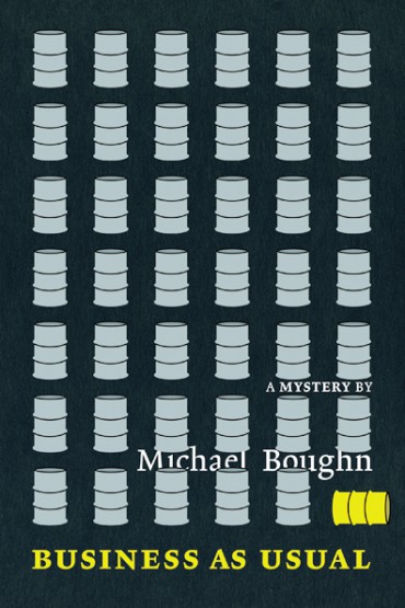
The “Nick and Nora Charles” of academia.
Two amateur detectives are pulled into a web of deceit and violence involving corrupt politicians and the illegal cross-border dumping of toxic waste. There’s some Mafia talk too.
The author suggested using barrels somehow, and instead of going photographic, I turned to a simple graphic.
I always find it interesting how titles come to be. Here is the passage that explains the phrase and how it applies to the plot: When you see something you don’t want to see, just pretend you didn’t see it. It was part of some kind of law. David called it the Law of Ontological Inertia. Lives in motion along certain paths tend to stay in motion along precisely those paths. Unless some terrific force intervenes. Also known, he said, as business as usual.
See more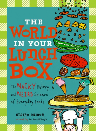
A few firsts:
the first kid’s book I’ve worked on, my first collaboration with Annick Press, and the first time I’ve attempted to use condiments as a design element.
I’m learning some interesting food facts along the way. (You don’t necessarily have to be between the ages of 8 and 12 to enjoy them.) According to an 18th-century travel writer, the illustrious sandwich was named after the fourth Earl of Sandwich, a man with a serious gambling problem.
The talented illustrator is Sa Boothroyd and I’m using a typeface that would make Bringhurst shudder. (Stovetop by Font Diner.) The handwritten font was created based off Sa’s printing.
See more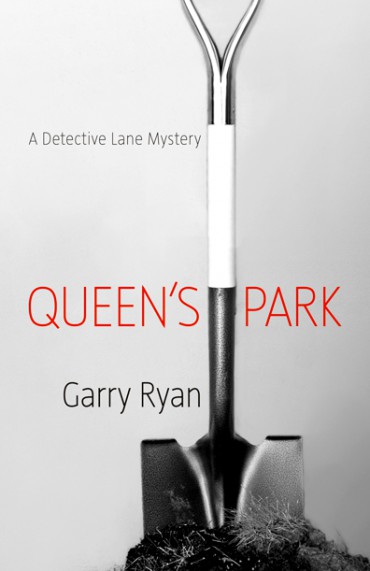
Ebooks need covers too.
I just gave Garry Ryan‘s first two Detective Lane Mysteries fresh faces in time for their Kobo debuts. I hope the books will be reprinted one day too, if only for the deep designerly satisfaction that will come from lining up the matching spines on my shelf.
The aesthetic for the series is being pieced together book by book, keeping with the same greyscale photographic approach and hairline type as the latest instalments, SMOKED and MALABARISTA.
(See the original Queen’s Park cover that was published by NeWest Press in 2004.)
(See the 2006 cover here.)
See more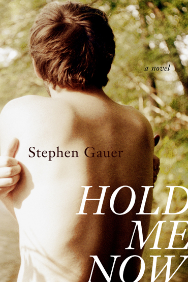
I’ve managed to hijack another striking piece of art for a small Canadian literary press.
Julia Skopnik‘s photo titled “my body questions you and your answers are in me” will grace the cover of an upcoming Freehand Books release by Stephen Gauer. Hold Me Now portrays a father’s grief after his son is beaten to death in Stanley Park,Vancouver, and the overt role that homophobia played in the incident.
Now I just have to figure out how to put type on it.
See more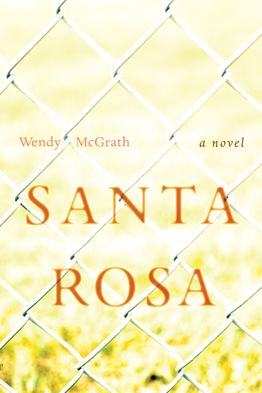
Santa Rosa: A Californian county, the Portuguese name for Saint Rose, an extinct community in Edmonton, and more recently, a book.
Taking full advantage of that fantastic Fall light, I set out to replicate the sense of otherworldliness and subtle nostalgia in Wendy McGrath’s new novel. The young narrator seeks the answers to these questions as she tries to make sense of the disintegration of her parents’ marriage — a process echoed by the slow disintegration of their neighbourhood.
The excerpt that sent me outside, looking for a chain link fence:
“The picture of the family as they walked the parking lot pavement was overexposed. Taken into the sun. Too bright. Too hot in some spots. The girl could feel the bottoms of her feet begin to warm. She had to squint against the sunlight shining on the chain link fence on either side of the entrance against carnival rides that roiled against the sky against the Ferris wheel an aperture perpetually open on her adventure.”
From Jamie Hall’s review in the Edmonton Journal on 04/17/11:
“And I thought there are many streets and houses and families and kids who have this sense of dreamlike attachment to a time that has passed.” In the book, which McGrath describes a “poetic narrative,” the narrator knows something is wrong but has no insight into what that is and has no way of articulating it. It’s not unlike any child observing the adult world, says McGrath, which to young minds can often be baffling, sad and at times frightening.
Looking for a place to live for just $10 per month?
(Courtesy of the City of Edmonton Archives.)
See more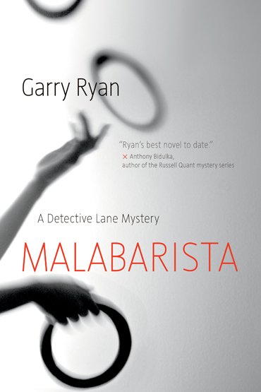
Award-winning mystery writer, Garry Ryan follows up SMOKED with another Detective Lane adventure. Malabarista is the Spanish word for street performer or juggler, and an appropriate metaphor for Lane’s latest role handling the new obstacles thrown his way.
And so, another comical photo shoot involving myself as the only available/willing model, a tripod, a timer, a ring cut out of black cardboard, and the realization that juggling is rather difficult.
See more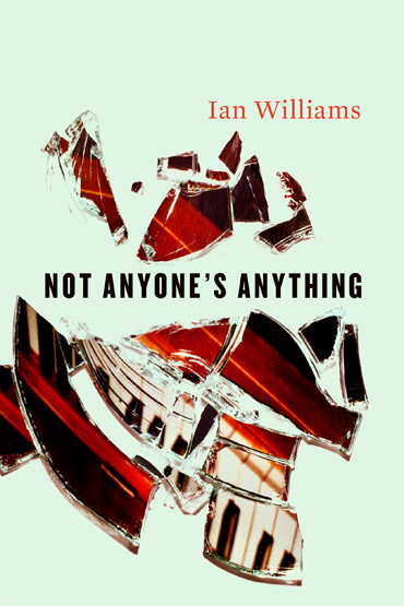
(Click for detail of the jacket.)
There are three sets of three stories, with three of those stories further divided into thirds.
Ian’s work is very experimental. The text is embedded with Korean flash cards, musical notations, literal basements, and divided/dual narratives.
See more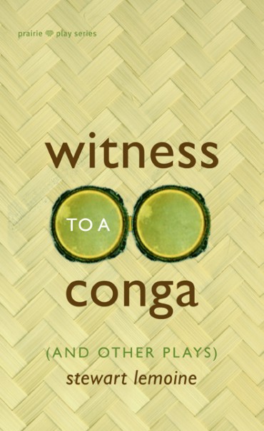
“You really can’t say no to a conga. Ever.”
Witness to a Conga, The Oculist’s Holiday, and Happy Toes — three plays originally written for the Edmonton Fringe Festival by Stewart Lemoine — soon to be coexisting between covers. Proficiently described by the publisher as “unexpectedly emotional explorations of marriage, love, and family.” Look for copies of the book at the Fringe this summer.
In the title play, Martin Lowell’s impending wedding, and his indecisiveness on the subject of including a conga at the reception, stirs up memories of his parents’ divorce and the great, unattainable love of his life. I set out to make a simple, linear dance seem more confusing and complicated than it actually is. The footsteps give the sensation of being on the outside of the fun, observing/discerning/learning from a distance.
I considered this next sketch rejected when the playwright admitted to not seeing a pair of glasses in the set of conga drums like I intended.
See more
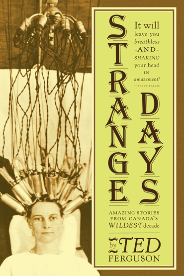
Ted Ferguson revisits dozens of stories from the ’20s — accounts of frivolous fads, shocking crimes, and the political and social changes that yanked Canada out of the 19th century and into the modern age. Subject matter includes: a British war hero who becomes a religious cult leader and turns his enclave in British Columbia into a hotbed of sadomasochistic orgies, a national baby derby, and some futile train/bank robberies.
The cover image hopefully relays the zany spirit permeating our so-called Jazz-age: hip flasks, the fox trot, and knee-high skirts, oh my. (Courtesy of the William James Collection, City of Toronto Archives.) And if you are still wondering, she is getting a perm.
The jacket was printed on 80-lb Mohawk Via Vellum in Ivory. It’s a very yellow paper that really intensified the colours.
With the era in mind, I used Frederic Goudy’s Kennerley, some old 84 pt. letraset for Algerian.
This was my first attempt at setting something in this lyrical but very quirky typeface, supplied unedited by the Lanston foundry. Let’s just say it was an elaborate exercise in kerning. Bringhurst describes this face as Goudy’s first successful attempt at type design, with the “flavour” and “homey unpretentiousness” of Caslon. I chose it because it exemplifies the era, especially when paired with my dry transferrable cover letterin’ companion.
(I also designed Ted’s last book, Back Roads.)
See more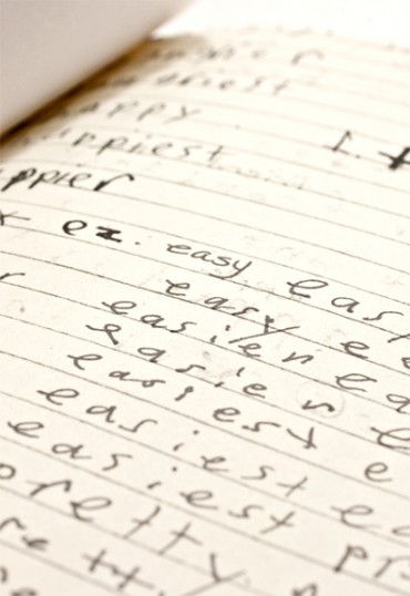
Kathryn Burke is a health care administrator turned education advocate who wrote a compelling and honest roadmap for parents of children with exceptional needs. (Her son Colin has learning disabilities and ADHD.) See LDExperience.com for more information about the book and other testimonies concerning LD. I scanned Collin’s dysgraphic handwriting and used it throughout the design.
See more
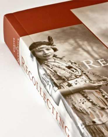
Essays that illuminate the lives of late-eighteenth-century to mid-twentieth-century Aboriginal women.
Cover image: Frances Nickawa during her early performance years. Sweet Heart (1924), Young Family Fonds, 94.094P/1. Courtesy of The United Church Archives, Toronto.
See more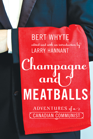
The brash, irreverent, informative, and entertaining adventures of a Canadian Communist.
The leftist rogue and protagonist, Bert Whyte, on the fly leaf with cigar in hand. Active for over 40 years with the Communist Party of Canada, Whyte was an underground historical rogue who challenged the illegality of left-wing politics during the 1930s and onwards. Brought to light and introduced by editor and historian Larry Hannant.
A hammer and sickle pin made it on to the left lapel on the spine.
The display face is Stephen Rapp’s Raniscript, which I paired with ITC Cheltenham (Tony Stan) and Trade Gothic (Jackson Burke). It was printed on 60 lb Rolland Opaque with two photo inserts on glossy paper (80 lb Sappi Flo).
See more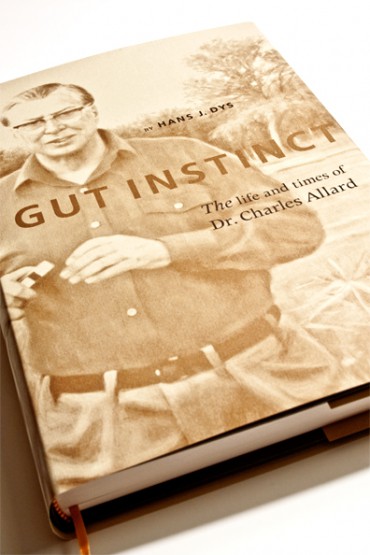
The Doctor.
I recently helped the Allard Foundation self-publish a 412-page biography on the late Dr. Charles Allard. The text was researched and written by Allard’s associate Hans J. Dys, of Filmbratz Productions. This “Edmontonian of the Century” led a remarkable life.
By request of the family, I worked with a portrait painted by Danielle Richard on the cover.
The title was de-bossed and stamped with a bronze foil on the grey hardcover. It was a much appreciated opportunity to break from the usual matte lamination and glue. The book was set in Adrian Frutiger’s Apollo MT and his sanserif face, Frutiger. It was printed with two colours (black and metallic PMS 8582) on 60-lb Cougar Natural Text by McCallum Printing Group. The monotone images and bronze screens turned out well. The dust jacket is the textured 80-lb Gilbert Oxford, in Path, from the Holly Hunt Collection.
See more
The best way to describe the challenge associated with this project is to quote the knowledgeable Paul Buckley from Penguin’s latest stunning, narcissistic book design endeavour: Penguin 75 Designers, Authors, Commentary (the good, the bad…). Buckley observes that “multiple parties wanting different things often lead to covers with rather literal visual interpretations… a scene from the story – this is not always a bad thing, but can lead to imagery that is a bit predictable.”
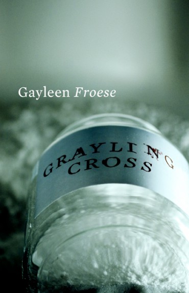
Which is what my first attempt at a paranormal mystery cover was. Unfamiliar genre territory. I made a mess first, just to get it out of my system.
Then I set out to make an eerie image that suggests a supernatural presence without employing any of the usual SPACE channel platitudes. The Press expressed an interest in taking a different direction from Froese’s first novel on the same theme, which has an off-puttingly dark and murky cover. The drawback of this quirky, light approach is that it doesn’t convey the genre with sufficient clarity.
I ended up photographing a jar of bath salts by request of the author, basically re-creating one particular unnerving scene from the book. I abstracted the object as much as possible with the camera angle, framing, and focus, in an attempt to gain fictitious approval from Buckley at Penguin.
At the very least, I think it successfully avoids pushing the fantasy element too explicitly. (Oddly enough, this is the second photo shoot that I’ve coordinated in my bathtub in the last year.)
My favourite detail in all three sketches is the title block. I nudged a printout of the title on a scanner bed as the bulb passed over, creating a slight blur in the text.
See more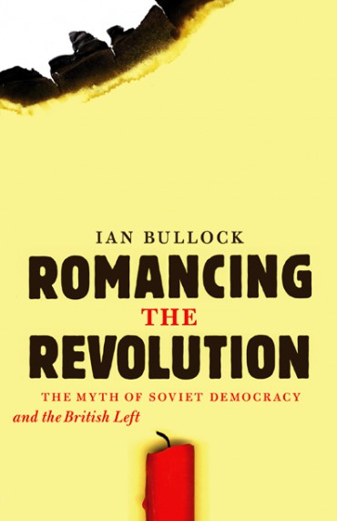
Apparently the Brits (“British Bolsheviks”) really had a thing for Russia right around 1917.
The full sales pitch:
Over two decades have passed since the collapse of the USSR, yet the words “Soviet Union” still carry significant weight in the collective memory of millions. But how often do we consider the true meaning of the term “Soviet”? Drawing extensively on left-wing press archives, Romancing the Revolution traces the reactions of the British Left to the idealized concept of Soviet democracy.
This making of this cover almost got out of hand, but I had a bucket of water nearby, thankfully. Letraset lended a hand.
See more
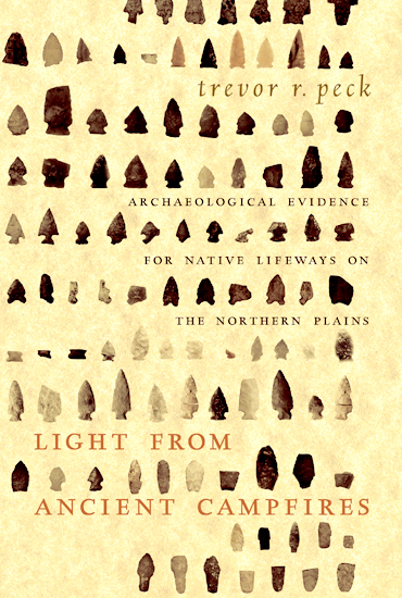
13,000 years worth of projectile points: Light from Ancient Campfires is a comprehensive archaeological record of the Northern Plains First Nations. Beginning with the earliest material traces of a human presence in Alberta, author Trevor Peck embarks on a detailed study of the physical evidence left behind by the area’s original inhabitants.
With 528 pages at 7 by 10.5 and weighing in at 3lbs, this book was dubbed “a weapon” by those who persevered with the production of such a lengthly and complex book.
The jacket was printed with 2 PMS colours on a 65lb parchment-style stock called Wausau Paper Astroparche, Ancient Gold. (Complete with french flaps.)
The arrowheads on the jacket are from the interior b+w plates and are in chronological order, grouped according to prehistoric period.
The text face is LTC Kaatskill, designed by Frederic Goudy and Jim Rimmer. The sanserif face is FF Seria, by Martin Majoor.
See more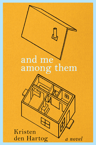
Ruth grew too fast.
The protagonist in Kristen den Hartog’s new novel is a girl with gigantism. From a bird’s-eye perspective, Ruth recollects her struggles to connect with other children in small-town, post-WWII Canada, and observes the lives of her parents, Elspeth, an English war bride and seamstress, and James, a mailman.
My first concept comes from a particularly compassionate moment in the book, when a boy takes the laces out of all his shoes and ties them together to make an extra long pair for Ruth. Shoelaces appear again in a less sentimental way after a bully ties Ruth’s shoes together to trip her at school. And once more in an excerpt that is so good, it needs to be reproduced here:
They boarded with their arms linked, and their two stories together were like strands made into a knot; you cross them, you tuck one under the other, and cinch them close. So simple, and yet it took me forever to learn how to tie laces. I thought I would never know, and then one day it came to me. I thought, That’s all? Because it had looked so complicated for so long.
Second idea: Ruth’s homemade pants that are lovingly pieced together by her mother, who unstitches and refashions her own dresses to make her daughter’s patchwork clothes longer, bigger, wider each time she grows.
In the selected cover, I was playing with the idea of Ruth existing in an awkward space between her home on the ground with the rest of the world, and the sky. At one point, her father renovates their house, lifting the roof off to raise the ceiling height.
See moreA major coup for both feminists and book designers.
The author is a fairly cautious person and was concerned about the risqué nature of this image. We let it sit for a few weeks and then decided that it successfully deviates from the aesthetic of other Feminist works and will definitely garner attention. I can’t take credit for the illustration: it was originally on a poster created by R. Salvadori for the Italian Feminist Reunion of the Socialist League.

About the collection: “Approaching her subject matter from an array of interpretive frameworks that engage questions of gender, class, colonialism, politics, and labour, Sangster explores the lived experience of women in a variety of specific historical settings. In so doing, she sheds new light on issues that have sparked much debate among feminist historians and offers a thoughtful overview of the evolution of women’s history in Canada.”
See more
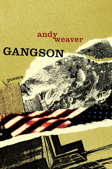
An examination of New York’s distant/not-so-distant history of violence.
The poems in Andy Weaver’s collection were composed somewhat mechanically, by cutting up, warping, and adapting existing texts. The title piece is chance-generated poetry inspired by the classic turn-of-the-century criminal study, The Gangs of New York by Herbert Asbury. Weaver took the first and last line of each page, typed them out as a series of couplets, and then whittled the poem down to its current state. I emulated Weaver’s writing technique on the cover — piecing together touristy photos from my visits to NYC, some burlap, and an old Draft Riot illustration — until I ended up with this
See more
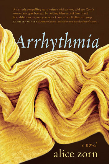
A rapid, irregular heartbeat rhythm.
And a good way to describe the central relationships in Arrhythmia, which is full of scandalous love affairs, conflicting cultural values, and betrayal.
Near the beginning of my process, Alice’s best writing buddy, Mark, a Kansanian who lives in Denmark, mentioned that if the title is in upper-case, then the R’s will look like Finnish-language gargoyles. Unfortunately, I couldn’t make that work with Hoefler’s Requiem.
Nevertheless, my fabric cardiographies.
I’ve been eagerly awaiting this novel since I finished Alice’s 2009 collection of short stories, Ruins & Relics.
See more
Yes, this is a cliché.
Education is a particularly challenging theme to design for due to the overwhelming amount of hackneyed school-related imagery out there. (apples, pencils, light bulbs, globes, chalkboards.) Distance Education is even tougher, because you have to toss all the technology clichés too. (binary code, flying computers, keyboards, electrical cords.)
So I did my best and produced four rough cover concepts for “Emerging Technologies in Distance Education” by George Veletsianos, and we posted them on his blog to solicit feedback from his colleagues. Some particularly insightful comments included:
“I like the 3rd one. It’s a bit old school. Whatever that means.”
“looks like you are offering me a cigarette.”
“B-boards (albeit subliminal) on ed books are, I’m afraid, a cliché.”
And finally, an ultimatum:
“I’ll only buy it if you choose #4 the other three are a bit pretentious.”
The “B-board” idea that was selected stems from the interactive whiteboard technology discussed in the book. The title has been traced with a finger into the dust on a chalkboard, showing a desire for tactile human interaction with a virtually obsolete learning apparatus. It’s a reminder of why new tools are necessary and also how far education has come.
It’s also a huge cliché.
See more
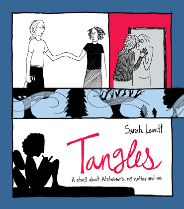
A story about Alzheimer’s, a mother, and a daughter.
I was fortunate to oversee the design of a graphic novel by the Vancouver-based writer/cartoonist, Sarah Leavitt. Sarah kept detailed notes and sketches for the duration of her mother’s illness, which will be coming to you in book form this summer from Freehand Books.
In spare black and white drawings and clear, candid prose, Sarah shares her family’s journey through a harrowing range of emotions — shock, denial, hope, anger, frustration — all the while learning to cope with a devastating diagnosis, and managing to find moments of happiness.
The font was built based on Sarah’s handwriting.
See more