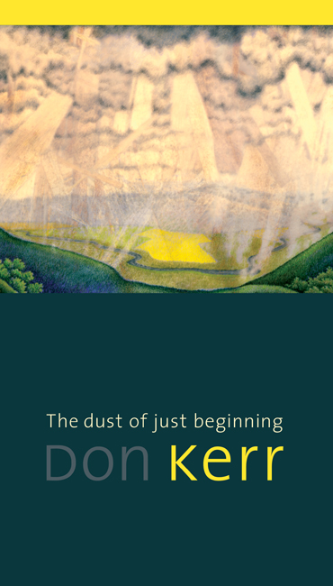
Don and Don: poems by Mr. Kerr, painting by Mr. Proch.
(artwork titled “Asessippi Valley, 2006”)
A hit of colour on the interior:
I developed a “unicase” style for headers, eradicating ascenders and descenders everywhere. And the interior was set entirely in a sanserif typeface, tradition be damned.
From the back of the jacket:
“Don Kerr knows prairie culture better than most — he knows it from the inside out. He has made us aware of ourselves through his numerous volumes of poetry, his fiction, his many plays, his histories, and his interest in heritage. In this mature, accomplished collection, we can once again admire his unique prairie voice — minimalist, self-effacing, direct yet subtle and nuanced, immersed in his love of the vernacular language of this place.”
And for your enjoyment, the best (non)author bio I’ve come across.
See more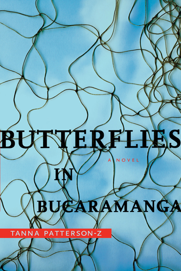
On the scanner bed: one tangled net + a photo of blue sky + the long and unpronounceable name of a municipality in South America.
A suspenseful thriller about a mining executive who is kidnapped by Colombian renegades, caught in a collision between Western corporate imperatives and revolutionary politics. I used a tangled net to link the insect-related title to the idea of captivity. I was originally working with the preliminary title, The Butterfly Effect, but there are already at least a dozen novels, numerous self-help books, and one really bad Ashton Kutcher movie that are already unsuitably referencing chaos theory.
For those of you who are astute, it is indeed a fish net, not a butterfly net. But the story is about capturing human beings, not insects, so it could potentially work.
And, a similar notion for a very different kind of book from Jason Booher. (Both books have the same release date, so no need to play the “who did it first” game.)
See more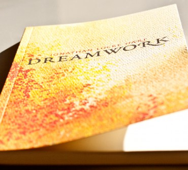
I am running out of interesting ways to put paintings on book covers.
I usually try to talk the publisher out of it. The original artwork is produced at a specific scale and isn’t meant to be experienced as a thumbnail. There are usually strict rules set in place by the museum or artist that prohibit cropping, bleeding, or adding type, which severely dampens creative freedom. The proportions rarely fill a 6 x 9 cover, so the designer is forced to set it against a bland flood of colour. The texture of the paint, brushstrokes, and canvas is lost. Modern digital printing technology can’t replicate the colour properly. (Just to name a few reasons…)
My first time tackling an art cover demanded several mock-ups until I found a way to use the prominent art piece in a dynamic but still respectful way.
My next attempt was for Dreamwork, Jonathan Locke Hart’s latest book of poetry. To make things even more challenging, the watercolour on the table was painted by the author’s mother. (No talking anybody out of that one.) Fortunately Hart values graphic design and art equally, so I proposed some alternative ways to display the piece.
But how many times have you seen a picture frame or a page turn on a book cover?
So I took an abstract approach instead by magnifying an area of the landscape with great light, and printed the jacket on a textured paper that mimicks the surface of canvas and augments the stippled brush work. The full painting was revealed following the last poem in the book.
(American artist Titus Kaphar might be heading in the right direction by obscuring and shredding the paintings…)
See more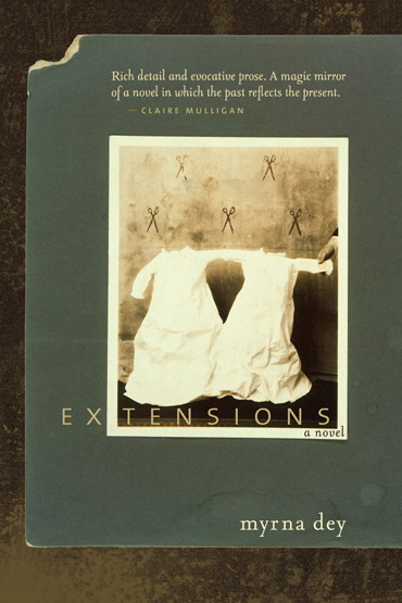
Don’t ask how, but I convinced the amazing Dan Estabrook to let me use one of his pieces on the cover of Myrna Dey’s first novel. Dan is based out of Brooklyn and exhibits in real cities like New York, Chicago and… Atlanta. He uses nineteenth-century photographic techniques to make contemporary art, working with hand-altered calotypes and salt prints. The piece I’ve absconded with is a mounted toned silver print called “Untitled Twins, 1992”.
Extensions tells the story of a woman who is uncovering information about her ancestors, and the impact that these bits of lost history have on her life. She makes the chance discovery of a sepia photograph of her grandmother and twin sister, in the hands of a stranger. So she decides to find out how a picture taken in 1914 in the mining town of Extension, BC ended up at a garage sale in small-town Saskatchewan almost 100 years later.
This artwork resonates perfectly with Myrna’s words, from the scissors right down to the teardrop stains on the green matte board.
I continued the scissor motif from Dan’s image throughout the book on the chapter title pages, losing count after about chapter 30:
I was originally hoping to employ an image by local photographer Eleanor Lazare, from her series My Aunt Molly’s Shoes. She projected old photos of her mother and grandmother on the wall, and then took a photo of herself standing in front of the screen. The construction of the series compliments the concept of the book perfectly by showing three generations of women and — quite literally — a reflection of the past onto the present:
Both artists are using historic photos in a contemporary way. Unfortunately, Eleanor’s images don’t accurately represent the genre. They suggest memoir or non-fiction by fixing the people in photos as characters in the book. The author requested that readers be free to invent their own visions of the characters. (I’m hoping to find a better literary fit for Eleanor’s work because I’m just in love with the series.)
See moreI decided to post this as a response to the many skeptical looks I’ve received after stating that I design books for a living.
This is what a book looks like pre-design. Basically, a massive pile of paper containing:
– Multiple versions of the manuscript typed up by the author in Microsoft word
– An editorial “road map” designating what might go where
– Lists with spelling, grammar, and stylistic corrections that need to be inserted from 3 or 4 rounds of editing
– Loose drawings torn from sketchbooks
– A reference guide labeling illustrations (in this case, 240 of them)
– Handwritten notes from all involved on $30 worth of post-its
This is what it looks like post-design and printing.
I designed a 6 x 10″ horizontal landscape format with 5″ wide jacket flaps that hold the author portrait drawings and bios. Olivier Martini is on the front flap and Clem Martini on the back.
The interior layout follows a 3-column grid system, running the illustrations on the verso pages and the text on the recto pages. I broke this rule occasionally to strengthen the dialogue between Clem and Olivier, when one brother’s story needed to take the spotlight.
Over the years, the various treatments Olivier experimented with affected his composure and the steadiness of his hands. So his mark-making changes throughout the book, reflecting side effects of medication like Stelazine.
On the back of the jacket:
“In 1976, Ben Martini was diagnosed with schizophrenia. A decade later, his brother Olivier was told he had the same disease. For the past thirty years the Martini family has struggled to comprehend and cope with a devastating illness, frustrated by a health care system lacking in resources and empathy, the imperfect science of medication, and the strain of mental illness on familial relationships.
Throughout it all, Olivier, an accomplished visual artist, drew. His sketches, comic strips, and portraits document his experience with, and capture the essence of, this all too frequently misunderstood disease. In Bitter Medicine, Olivier’s poignant graphic narrative runs alongside and communicates with a written account of the past three decades by his younger brother, award-winning author and playwright Clem Martini. The result is a layered family memoir that faces head-on the stigma attached to mental illness.
Shot through with wry humour and unapologetic in its politics, Bitter Medicine is the story of the Martini family, a polemical and poetic portrait of illness, and a vital and timely call for action.”
See more
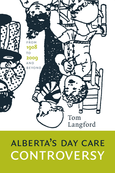
Controversial kids: apparently, between 1908 and 2009, daycare has been a point of contention in this province.
This is my preliminary solution for the cover of Langford’s exposé. The grainy illustration was pilfered from a child care manual circa 1986. I’m pushing for the upside down orientation, but it will take some cajoling.
The formidable Marvin Harder will be designing the interior.
(I told myself I wouldn’t indulge in white book covers anymore. They blend into the background on-screen. When the books are shipped from the plant, the plain white stock is always a disappointment. In this case, the stark contrast of the source drawing is responsible for my relapse. The black on white gives it that “low resolution output device on low grade paper” feel that suites the bureaucratic topic.)
See more
For the third book in Roy Innes’ mystery series, I etched the cover image and title into an inked board using various pointy objects:
The interior chapter numbers are also carved by hand, based on FF Quadraat by Fred Smeijers.
I designed the last installment in 2007 using the same illustration technique. The setting is important in both books, so I found a way to describe two contrasting environments in a similar visual rhetoric: Downtown Vancouver and the cattle ranching district of West Caribou, British Columbia.
See more
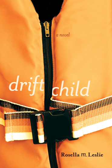
Cover proposal for an upcoming NeWest Press release that develops around a boating incident. The lifejacket alludes to water without actually showing it. (I feel like ominous coastline imagery is a little stale for aquatic-fiction.) The vest will either come to someone’s rescue or share in their demise: Dramatic + poetic at the same time.
There is friction surrounding whether this cover suites the story and author’s tone of voice. This cover design is a grand departure from Rosella’s first novel along the same theme. No question that it would jump off the shelf, but is it a misleading sell?
See more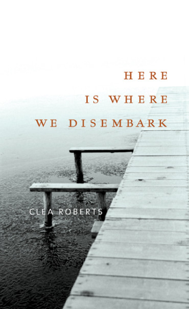
Clea Roberts is a poet from Whitehorse and this forthcoming collection focuses on the North, incorporating historical threads and ecological concerns. We came to a consensus that the cover should be sparse, cold, speak to both the past and present, and possibly incorporate landscape or water.
While reading the manuscript, I recalled a black + white photo series I did a few years ago with my old Pentax SLR. It must have been mid-November and I was lucky enough to witness (and capture on film) a lake freezing over. I set up a tripod on the dock and took a new shot every couple of hours over the course of two days. The water was still open on the first night (really cold…) and by morning, the surface had started to ice over.
A contact sheet for one of the (many) rolls of film:
I made two covers using these negatives:
Some blatant product pushing for Kodak:
They both represent the book nicely. The reader is first greeted with an environment that is unknown, isolated, and a bit haunting. The publisher picked the first, more simplistic cover. (Reinforcing a typical industry standard: When presented with multiple options, the client will almost always pick the designer’s least favourite design. So don’t show anybody anything you aren’t completely happy with, exclamation point.)
See more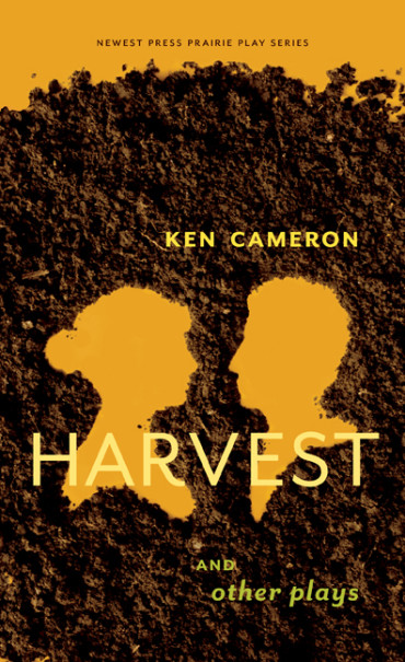
Playing with dirt for a collection of plays by Ken Cameron: Harvest, My Morocco, and My One and Only.
This cover concept is my “anti-blue-sky-prairie-scene” approach: I raked loose dirt around to generate two victorian-style silhouettes. The suggested dialogue between the figures reflects the relationship between Cameron’s mother and father in the title play. All three plays have central male-female relationships actually, so it represents the collection nicely. (But unfortunately leaves Cameron’s reinvention of Marilyn Monroe out…)
Just two days before we go to print, it is decided that a pot leaf needs to make an appearance on the cover. Marijuana = shock appeal and marketability, apparently. Design briefs work much better at the beginning of the process, not at the end. Nevertheless, I went digging through the garden for art supplies, again.
I prefer my original concept, but author trumps designer on this one.
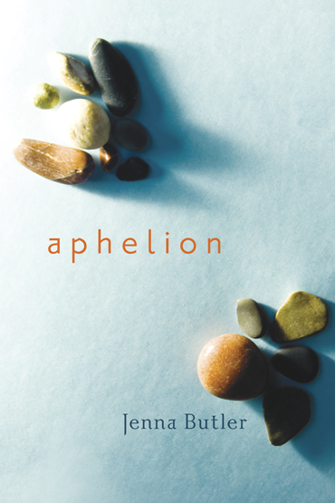
This past weekend, the author of Aphelion and NeWest’s GM joined me with glue-sticks in hand to make bands which will wrap around review copies of the book. The line “cross the pond” playfully obscures the title and reinforces the continental drift scene I tried to orchestrate with the stones:
“Aphelion” is the point in the orbit of a planet, asteroid, or comet at which it is furthest from the sun. The poems encompass the idea of physical/emotional distance and contrast the human and natural world. Each poem is grounded in the landscape of either Europe or Canada, depending on where she was writing at the time.
To achieve the high contrast lighting in the photo, I placed the stones in their groups on blue tissue paper inside my bathtub, using the contained area and white fiberglass walls to control the depth and direction of the shadow.
The stones in my cover photo was inspired in particular by two consecutive poems in the collection called “Petroglyph Trail” and “Letter to Nancy”:
“light catches the stone
just so
revealing hairline fractures
small imperfections
…
dusk breaking
across marble
reconfiguring
your absence”
I paired Gill’s Joanna with Barnbrook’s Priori sans and serif.
See more
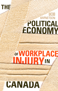
Instead of focusing on workplace safety (hardhats and goggles) or going gruesome like a lot of the Workers’ Comp. ad campaigns do, I decided to hit a sympathetic note with injury related imagery.
(1) Okay, I just mocked up the cast using a stock photo. I’ve done a lot of things to get a photo for a project (including tying my little brother to a chair, coating a person’s face with charcoal, persuading the director of the University bookstore to open the doors on a holiday and sell me medical equipment… to name a few.) But sneaking into a hospital to write on an injured person seemed excessive.
(2) I fashioned a book with the title on the front and then bandaged it up. I considered using band aids, but the gauze really gives the impression it’s holding something fragile together when wrapped around to the back of the jacket.
(3) A prime example of what I like to call opportunistic typography:
Personifying letterforms and then decapitating them.
(4) The approved concept exhibits the title on the greeting card in a looming get well soon bouquet. The sombre tone suits the content and alludes to injury and consequence without showing it.
See more
Absolutely thrilled to be playing with LEGO in the name of literature.
(1) My challenge was finding ways to reveal LEGO as a psychological tool, not a toy. The first concept shows an inventory of pieces, leaving the final fabrication up to the imagination of the viewer.
(2) This next idea resulted from two things:
First – The LEGO robot I was attempting to build fell apart suddenly.
Second – When I’m lacking inspiration, I usually attempt to put type on something that isn’t suppose to have type on it. (also known as vandalism to some) I wrote on the blocks by hand, but it looked too unmethodical, so I covered it with a bold sans serif. (Thank you, Erik)
(3) A change in direction: Juxtapose the personal with the mechanical, I rendered the familiar building blocks as a pattern instead of a tool. However, the drawing style is a little too juvenile for graduate level psychology.
(4) Okay, I’ll put a robot on it. The final cover employs a rendering of a LEGO robot discussed in the text, cropped to abstract the form slightly.
Sometimes it’s nice to rescue a rejected cover idea by using it for the back of the jacket or interior design somehow. I placed an inventory of LEGO pieces isometric-projection-style on the back instead, creating a nice before and after relationship with the already-constructed robot on the front. We printed a spot gloss over the red lines and text.
See more
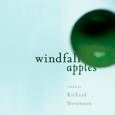
“little windfall apples / green cherry bombs / each with unlit fuse”
(From one of Richard Stevenson’s poems.)
I think the imagery that these lines evoke is really interesting. However the publisher felt my apple-bomb was a little enigmatic and could be mistaken for a Christmas ornament.
I possess a natural aptitude for taking out of focus photographs, which actually worked in my favor here. The lack of focus obscures the object, but the imagery is still too direct.
My first two photographic attempts were abandoned for an illustrative approach that suits Stevenson’s work better. The square format (5 x 5″) provides symmetry and generous white space around each of the five-line poems.
It was a two colour job using orange and brown ink on yellow paper (mohawk via) with a linen finish. The interior includes a few colour pages. I lifted the orange/yellow hues from the original photos and then placed the colour back on top of greyscale versions, resulting in sort-of-duotones.
Blazers & Boleros:
another phase in my ongoing mission to make the backs of books more interesting. Bookstore frequenters should be drawn to the back side as much as the front side because while a nice smile is great, a nice backside closes the deal. A slightly inappropriate analogy, but you get the point. (Click for jacket for detail.)
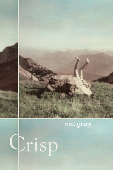
The artwork is by Canadian photographer Nathalie Daoust (very envious that she gets to spell her name with an ‘h’). It’s called “Pilatus” and is part of her “Frozen in Time, Switzerland” series. Amazing work. The photo captures the themes of nostalgia, landscape and absurdity that are apparent in Robert’s magic realist-ish tales.
The off-kilter title amplifies the sense of awkwardness and absurdity in the cover image and Gray’s stories. I continued this shifted-baseline motif throughout the interior.
Crisp took part in some hearty Atlantic-themed cover rivalry, provoked by Salty Ink blogger Chad Pelley. The jacket came in second place in the 2010 Judge-a-book-by-its-cover competition.
See more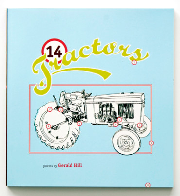
John Deere inspired.
Low bow to Gerry Hill and NeWest Press for snaring the Poetry Award at the Saskatchewan Book Awards last night.
The word “tractors” in the title block was hand-drawn. The rest of the 14 tractors appear on the back of the jacket.
The interior is full of visual material pilfered from vintage tractor manuals and photographs taken by Shelley Sopher.
I was originally aiming for an understated prairie poetry feel with the cover, but playing with the visual aesthetic of the retro John Deere manuals was so much more fun. The end result is unavoidable on the shelf.
See more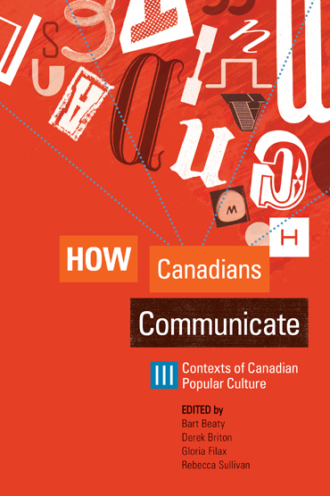
I combined found letterforms from various media to make the jacket for the 3rd volume in the “How Canadians Communicate” series. The collection of essays focuses on Canadian pop culture and censorship and how these things ignite expression.
See more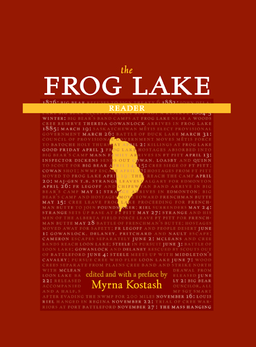
Myrna Kostash offers a startlingly objective perspective on the tragic events surrounding the Frog Lake Massacre of 1885. My type-dominant cover design stems from Kostash’s comprehensive chronology of events that accompanies her text.
The jacket has a gloss lamination with a spot matte varnish overtop of select areas. The result is a subtle luster in the numbers and names of the timeline on the front and back cover.
An interior chapter title page with an 1885 illustration from the Glenbow archives and my proudest typographic accomplishment to date: the use of “outdents” instead of indents at paragraph starts.
A hand-drawn map of the Alberta-Saskatchewan area that tracks the journeys of several main characters.
The display typeface is Albertan, designed and cut in metal at the 16 pt. size by Jim Rimmer in 1982. The text face is ITC Kaatskill, which was originally designed by Frederic Goudy and later completed by Jim Rimmer for the Lanston Type Company. And the sans serif is Robert Slimbach’s Cronos Pro.
See more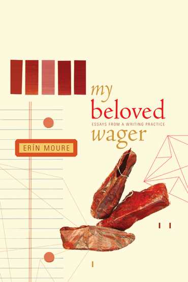
A collection of essays by Erín Moure, a poet and translator from Montreal. In her linguistic-sculptural interventions on what poetry makes possible, Moure reveals why she has placed her bets on poetry as a way of life. The red shoes are from an installation by Vida Simon called “Walking to Russia” in Moure’s hometown Montreal.
See more
I just came across one of my discarded cover mockups for this thriller novel. I never presented it to the publisher because of the questionable readability in the title. But I like the texture (created by scanning in crumpled saran wrap over top of the type)
See more
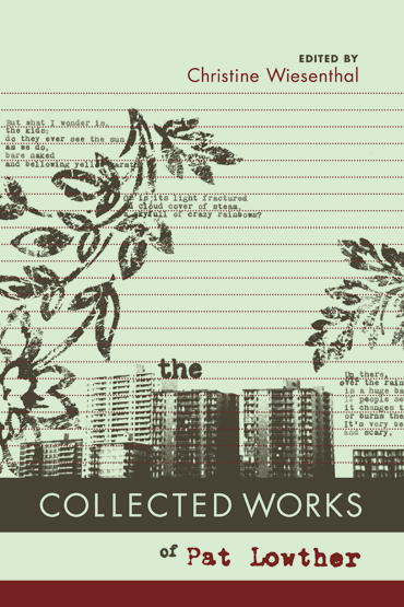
NeWest Press is publishing a comprehensive collection of poetry by the late Pat Lowther (1935–1975). Compiled by Chris Wiesenthal, the book revives Lowther’s out-of-print pieces and unveils never before collected and unpublished ones.
Featuring: a cerlox-inspired spine, some dated floral wallpaper, a little Paul Renner, and 2 spot colours on green paper. (Click for more detail.)
For the design, it was a struggle to capture the strictly mediated way that Lowther and her lifetime of work can be known by us now so many years later. The style of the cover stems from archived photos of Lowther’s notepads from the 1960/70’s. The imagery promotes both her natural and urban perspectives with retro floral wallpaper and black & white slide film shots of old office buildings. The composition strives for a balance between a dated and progressive aesthetic, as Pat Lowther was definitely forward-thinking for her time.
Printed with much care and attention by Transcon, this piece couldn’t have turned out better. The jacket stock is 80# Mohawk Via Smooth in Willow, an uncoated paper. The fly leaf is 80# Rainbow from Coast paper in Maroon, embossed with a texture. Following the fly leaf is a full bleed photo of Pat Lowther.
The text face is Trump Mediäval designed by Georg Trump in ’54. The sans is the anachronistic Futura, a geometric sans serif designed by Paul Renner in ’24-ish. The typewritten letters that appear on the section title pages and the typographic ornaments in “The Age of the Bird” are scans from P.L.’s original manuscripts.
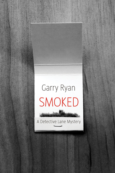
No blood, weapons, or other cliche imagery allowed.
The cover mocks take different visual approaches to the same concept, using matches to tie in with the title and suggest a potentially precarious situation.
The cover of Smoked was recently acknowledged as one of Lambda Literary’s best book covers of 2010. (Residing humbly in the list among some really impressive work by Rodrigo Corral Design, Jason Booher, Eric Hanson, and Chip Kidd.)
We came up with a fun but potentially perilous marketing strategy: matchbooks.
More matchbooks here!
See more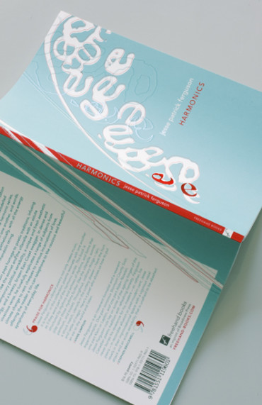
“eeeeeeeeeeeeeeeeee”
The cover concept stems from a visual poem by Jesse Patrick Ferguson called “mama” that merges visual art with the written word.
My cover illustration incorporates elements from Jesse’s visual poem called “mama” from the interior. The page numbers run vertically in the outer margins and switch direction in the second part the book. This orientation reflects the structure of the collection, where poems are grouped into pairs and appear at equal intervals in the two halves of the book. The first half contains the Fundamental Tones and the second holds the Overtones. The jacket is a 3-colour job with a spot UV gloss over the title, author name and outlines of the illustration.
See more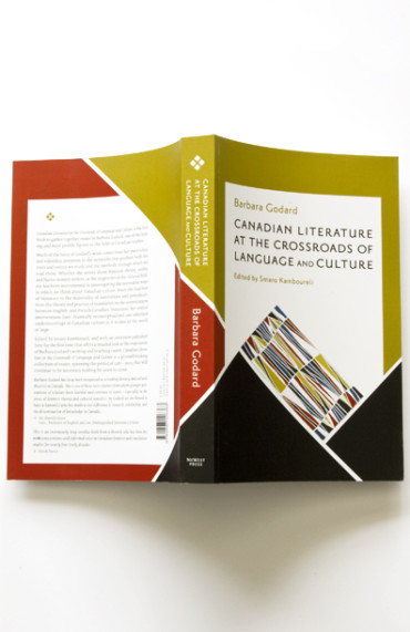
“One more time, with panache,” the editor requested after rejecting my first two ideas.
This is the first book to gather essays by Barbara Godard, one of the leading figures in the field of Canadian studies. Her work has been instrumental in interrogating the normative ways in which we think about Canadian culture.
Below are two initial mockups for the cover design followed by a photo of the final product. It was a challenge to make use of the prominent Canadian art piece while achieving the “panache” (client’s expression, not mine) that the editor was looking for.
[ art = “Sans titre.” Marian Dale Scott, Acrylique sur toile, 213 x 101cm, Printed with permission: Musée national des beaux-arts du Québec]
The sans serif is Priori Sans designed by Jonathan Barnbrook in ’03.
See more
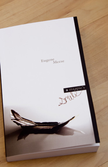
I recently designed the jacket and interior for a chronological police thriller written by Eugene Meese that takes place in Calgary in the 1970s. I shot the cover photo using a magpie feather I found in my backyard, bending it to create the concave shape. The word “smile” in the title block was sculpted out of floss (a little facetious maybe) and is accompanied by the typeface Galliard, which was designed by Matthew Carter in 1978 and later licensed by ITC.
It’s always a challenge to make a mystery cover that evokes a sense of suspense without falling into that conventional cliché–ridden thriller category. (No blood, bullet holes or all caps necessary.)
See more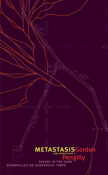
just off the press: a book containing three plays by Gordon Pengilly on the theme of human tragedy, paranoia, and violence. I created a web-like illustration that embodies the concept of metastasis as it spreads across the jacket and appears several times throughout the interior.
See more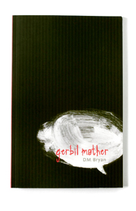
A sardonic look at motherhood and the family dynamic through the eyes of an unborn baby narrating from inside her mother’s womb. The one client stipulation for this cover was “no fetuses on the front, please.”
See more
My cover illustration for a cautionary tale with a bleak portrayal of socio-economic collapse resulting from an unsustainable way of life.
See more