How to Be a Literary Voyeur:
Seen Reading is a collection of microfictions based on the original blog of the same name, which from 2006–2011 catalogued sightings of people reading in public. It stems from Julie Wilson’s compulsion to note what people are reading, which eventually gave way to a compulsion to narrate the readers themselves. The result is a thoughtful call and response, the act of reading inspiring an act of writing.
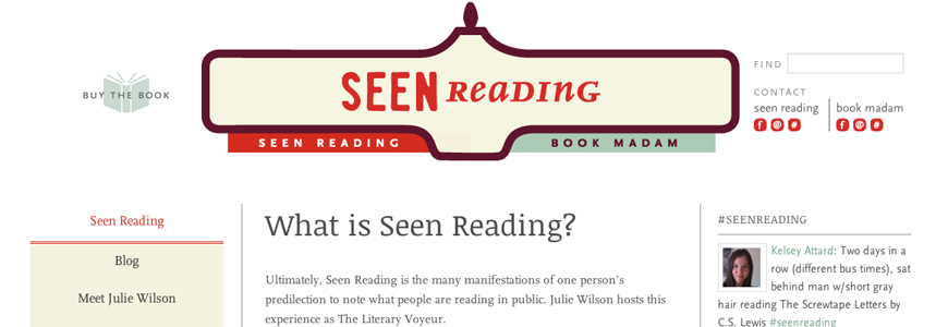
When I met with Julie in Toronto to discuss the project, she expressed aspirations for a versatile visual system that could extend to all facets of the Seen Reading movement: the book, all associated marketing collateral, a revamped web presence coordinated by Vicki Ziegler, and anything else that might pop up.
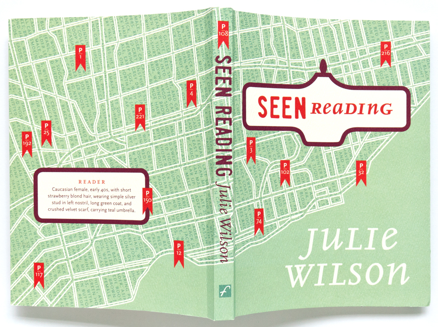
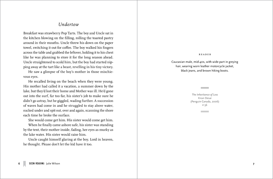
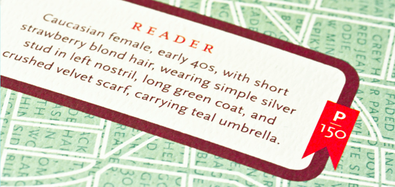
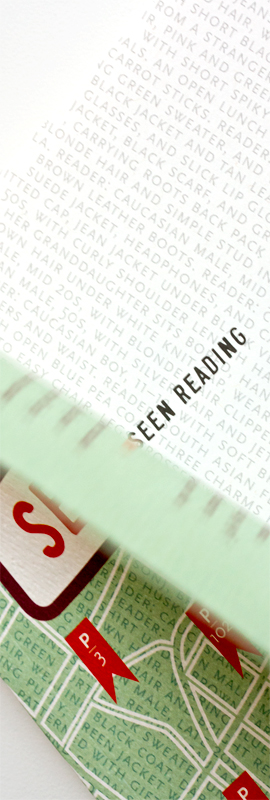
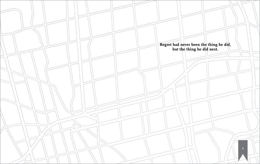
To begin, I created a logotype using recognizable letterforms by Dave Murray that are based on the classic weathered black-and-white Toronto street signs. To round out the brand, bright red flags chart reader locations on linear maps of downtown Toronto, marking an urban centre’s cultural commitment to literature.
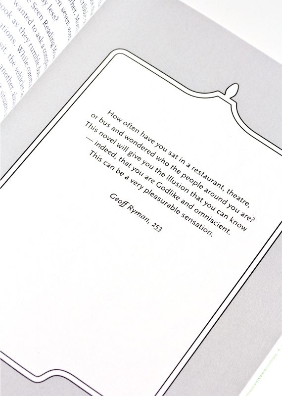
In the book, Julie’s short chapters of poetic prose sit on the verso, facing the reader descriptions and book information. It was printed on 80 lb Mohawk Loop Feltmark Natural and 60 lb Rolland Opaque Natural. The text face is FF Scala and the accompanying sans serif designed by Martin Majoor.
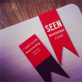
Post your own reader sightings on Twitter using the hashtag #seenreading.
Client: Freehand Books
Author: Julie Wilson
Publication Date: April 2012
Awards: Winner of the 2013 Book Publishers Association of Alberta Award for Book Design

