
Blazers & Boleros:
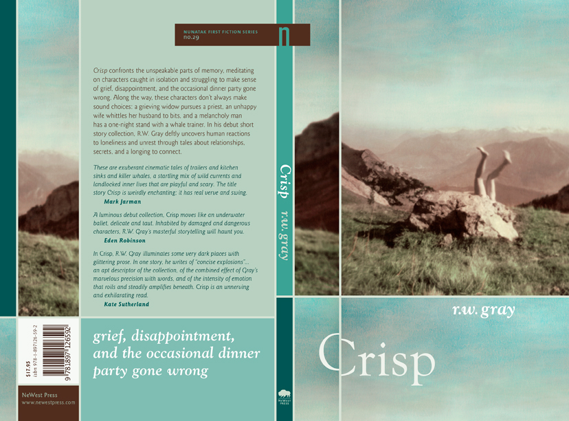
another phase in my ongoing mission to make the backs of books more interesting. Bookstore frequenters should be drawn to the back side as much as the front side because while a nice smile is great, a nice backside closes the deal. A slightly inappropriate analogy, but you get the point. (Click for jacket for detail.)
The artwork is by Canadian photographer Nathalie Daoust (very envious that she gets to spell her name with an ‘h’). It’s called “Pilatus” and is part of her “Frozen in Time, Switzerland” series. Amazing work. The photo captures the themes of nostalgia, landscape and absurdity that are apparent in Robert’s magic realist-ish tales.
The off-kilter title amplifies the sense of awkwardness and absurdity in the cover image and Gray’s stories. I continued this shifted-baseline motif throughout the interior.
Crisp took part in some hearty Atlantic-themed cover rivalry, provoked by Salty Ink blogger Chad Pelley. The jacket came in second place in the 2010 Judge-a-book-by-its-cover competition.

