
I formed some letters using wheat for a 12 month homesteading guide forthcoming from Skyhorse Publishing in New York. (A tip: wheat isn’t as mouldable as you might think — I had to soak it for a while before I could manipulate it.) The projects are organized by month and suitable for all kinds of self-sufficient folks, whether you live on a forty-acre farm, a postage-stamp lawn in suburbia, or in a high rise.
See more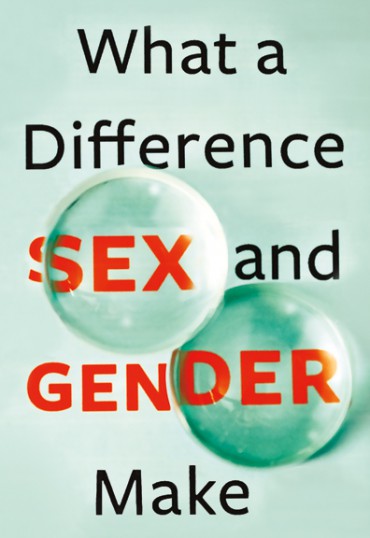
The Gender and Health branch of the Canadian Institutes of Health Research brought together some new research and approached me for the packaging of 12 cases. One of the cases discusses the idea of a “gender lens” that prevents industry professionals from seeing issues clearly as they pertain to males and females … which turned into the most challenging photo shoot I have ever attempted. I purchased several convex and concave lenses from a high school science supply store and experimented with placing the lenses over the title in different ways.
And, because it’s a government publication, I had to do it all over again in french, of course.
See more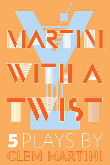
This project came with a title pun of sorts and a too-good-to-be-true brief: “just do some kind of bold, colourful, perhaps Art Deco-style all-text cover.” I went straight to the typeface Bifur, originally designed by Cassandre in 1929 and recreated by P22 in the 90s. The ‘Y’ letterform already looks a bit like a martini glass, it only needed minor adjustments.
About the plays: Absurdity reigns in multiple award-winning author and playwright Clem Martini’s newest collection of work: five plays spanning two decades, from 1989 to 2009. A lonely elephant handler befriends the half-blind woman who drove through his yard, a severed head in a suitcase life support system is given a second chance at life, a quiet shut-in wrestles with the jealous ghost of his wife, a young woman with the ability to smell lies struggles to make new friends, and a mismatched pod of whales in the Pacific Ocean struggle with identity, love, and interspecies dating. With a sharp tongue and impeccable comedic timing, Martini’s characters resonate beyond their impossible situations, their fears and hesitations all too human.
The other concept I was asked to mock up is a whale swimming inside a martini glass. I gave it a go, I really did, but it somehow evolved into a martini-fuelled photo shoot using the glass I was drinking from to obscure the title.
See more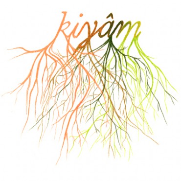
I was asked to do the impossible: create an image that blends the author’s Cree/Ojibwe/Scottish/English heritage. Naomi McIlwraith’s new collection of poetry is written in both English and Plains Cree, and focuses on the concern of language loss.
Below is my preliminary pencil crayon sketch for the title block. Root imagery not only pops up often in the text, but is a fitting way to represent McIlwraith’s intricate lineage. Her work talks about language being rooted in the land, the multiple definitions of Seneca root, and the structure/roots of words.
See more
Five Steps to an Ordinary Life:
1. Get a real job.
2. Stop seeing the world as a series of potential paintings.
3. Learn how to talk about the weather.
4. Do the things that normal people do.
5. Figure out what normal people actually do.
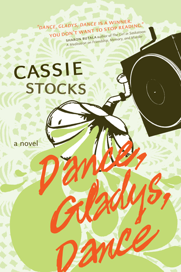
The synopsis for the 2012 NeWest Press release: 27-year-old Frieda Zweig is at an impasse. Behind her is a string of failed relationships and half-forgotten ambitions of being a painter; in front of her lies the dreary task of finding a real job and figuring out what “normal” people do with their lives. Then, a classified ad for a ’78 phonograph in the local paper introduces Frieda to Gladys, an elderly woman who long ago gave up on her dreams of being a dancer.
See more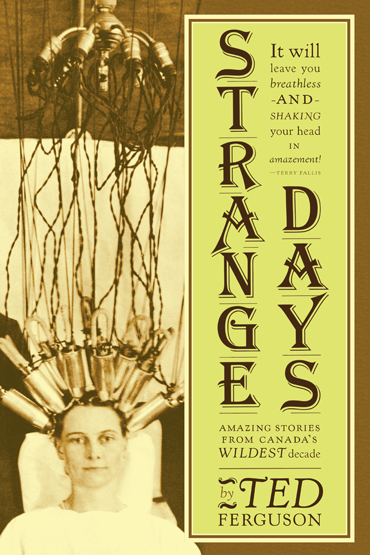
Ted Ferguson revisits dozens of stories from the ’20s — accounts of frivolous fads, shocking crimes, and the political and social changes that yanked Canada out of the 19th century and into the modern age. Subject matter includes: a British war hero who becomes a religious cult leader and turns his enclave in British Columbia into a hotbed of sadomasochistic orgies, a national baby derby, and some futile train/bank robberies.
The cover image hopefully relays the zany spirit permeating our so-called Jazz-age: hip flasks, the fox trot, and knee-high skirts, oh my. (Courtesy of the William James Collection, City of Toronto Archives.) And if you are still wondering, she is getting a perm.
The jacket was printed on 80-lb Mohawk Via Vellum in Ivory. It’s a very yellow paper that really intensified the colours.
With the era in mind, I used Frederic Goudy’s Kennerley, some old 84 pt. letraset for Algerian.
This was my first attempt at setting something in this lyrical but very quirky typeface, supplied unedited by the Lanston foundry. Let’s just say it was an elaborate exercise in kerning. Bringhurst describes this face as Goudy’s first successful attempt at type design, with the “flavour” and “homey unpretentiousness” of Caslon. I chose it because it exemplifies the era, especially when paired with my dry transferrable cover letterin’ companion.
(I also designed Ted’s last book, Back Roads.)
See more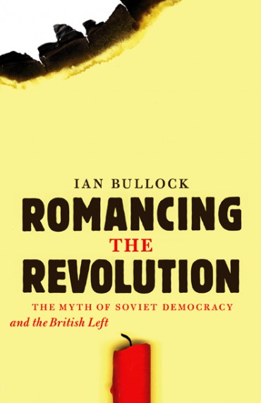
Apparently the Brits (“British Bolsheviks”) really had a thing for Russia right around 1917.
The full sales pitch:
Over two decades have passed since the collapse of the USSR, yet the words “Soviet Union” still carry significant weight in the collective memory of millions. But how often do we consider the true meaning of the term “Soviet”? Drawing extensively on left-wing press archives, Romancing the Revolution traces the reactions of the British Left to the idealized concept of Soviet democracy.
This making of this cover almost got out of hand, but I had a bucket of water nearby, thankfully. Letraset lended a hand.
See more
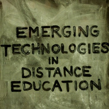
Yes, this is a cliché.
Education is a particularly challenging theme to design for due to the overwhelming amount of hackneyed school-related imagery out there. (apples, pencils, light bulbs, globes, chalkboards.) Distance Education is even tougher, because you have to toss all the technology clichés too. (binary code, flying computers, keyboards, electrical cords.)
So I did my best and produced four rough cover concepts for “Emerging Technologies in Distance Education” by George Veletsianos, and we posted them on his blog to solicit feedback from his colleagues. Some particularly insightful comments included:
“I like the 3rd one. It’s a bit old school. Whatever that means.”
“looks like you are offering me a cigarette.”
“B-boards (albeit subliminal) on ed books are, I’m afraid, a cliché.”
And finally, an ultimatum:
“I’ll only buy it if you choose #4 the other three are a bit pretentious.”
The “B-board” idea that was selected stems from the interactive whiteboard technology discussed in the book. The title has been traced with a finger into the dust on a chalkboard, showing a desire for tactile human interaction with a virtually obsolete learning apparatus. It’s a reminder of why new tools are necessary and also how far education has come.
It’s also a huge cliché.
See more